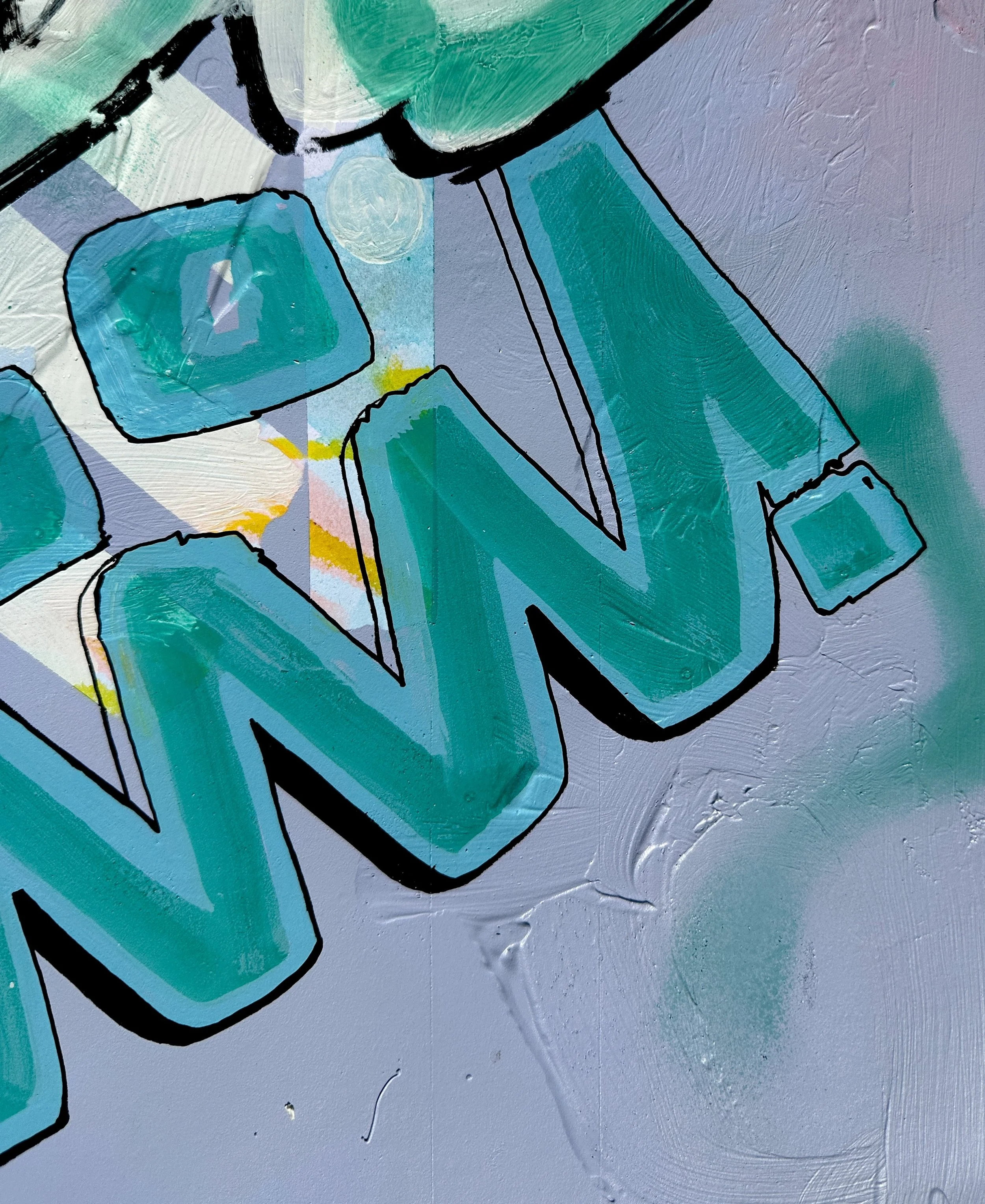
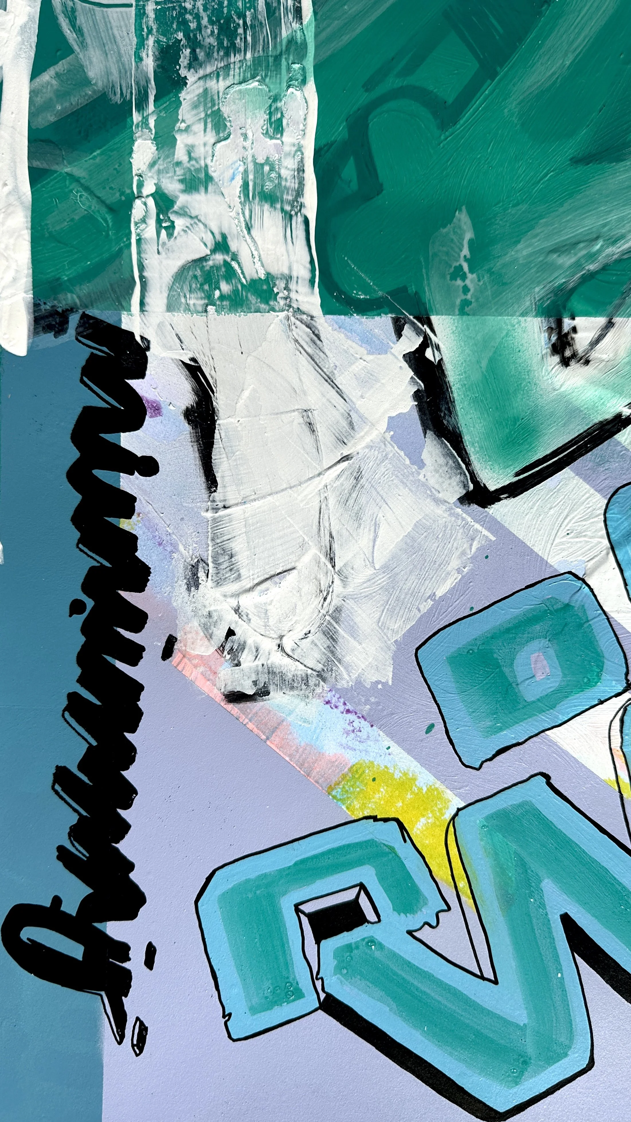
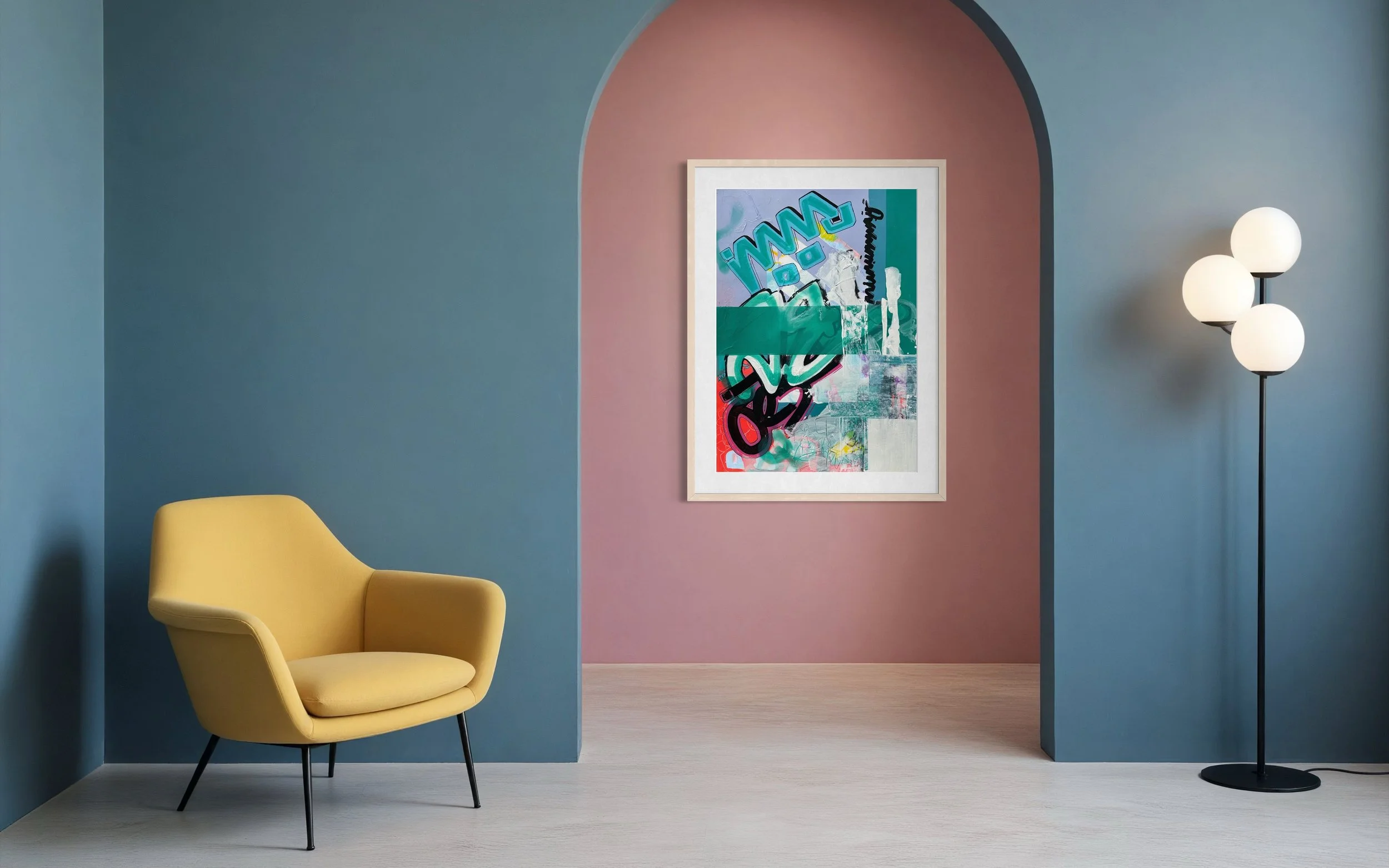
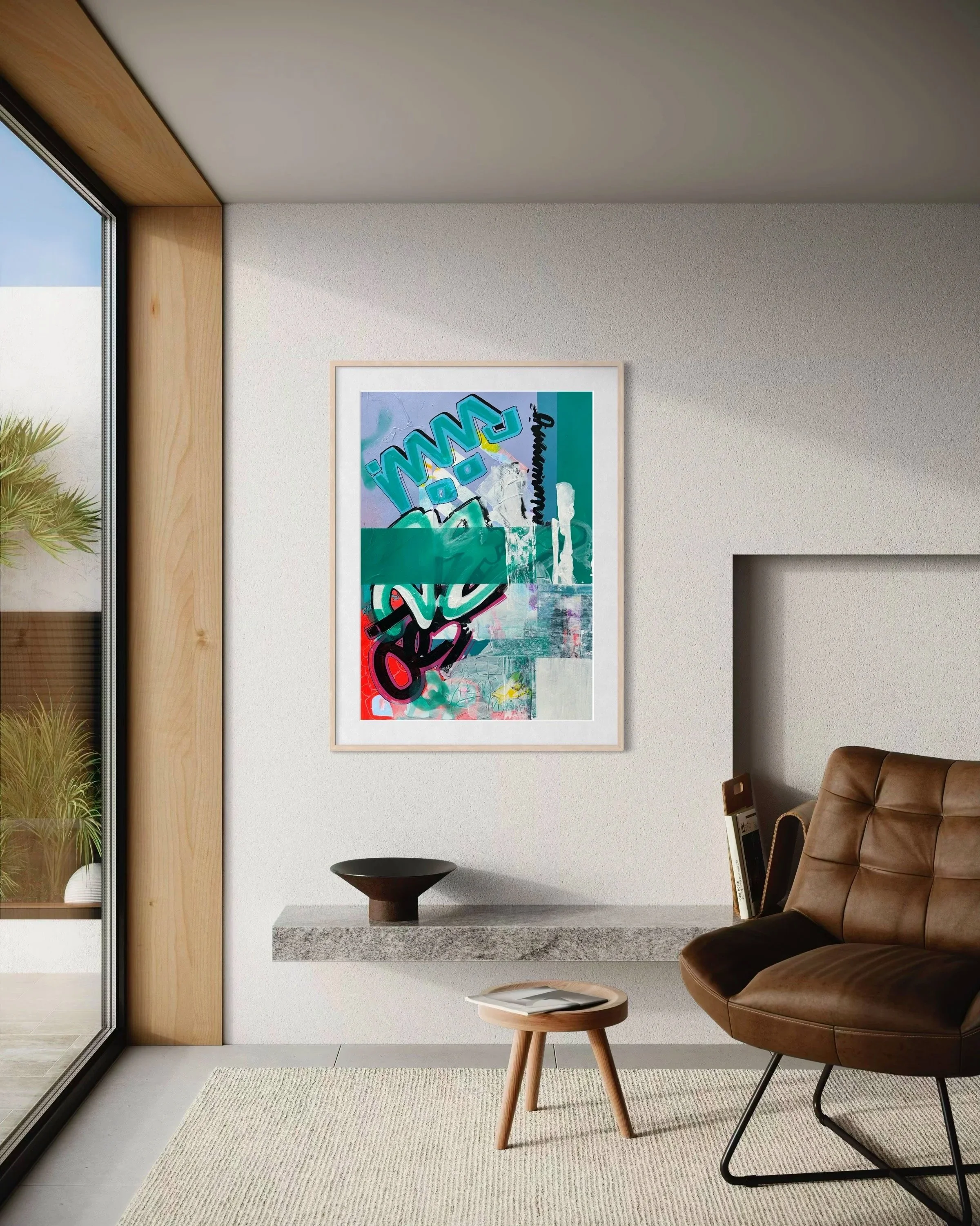
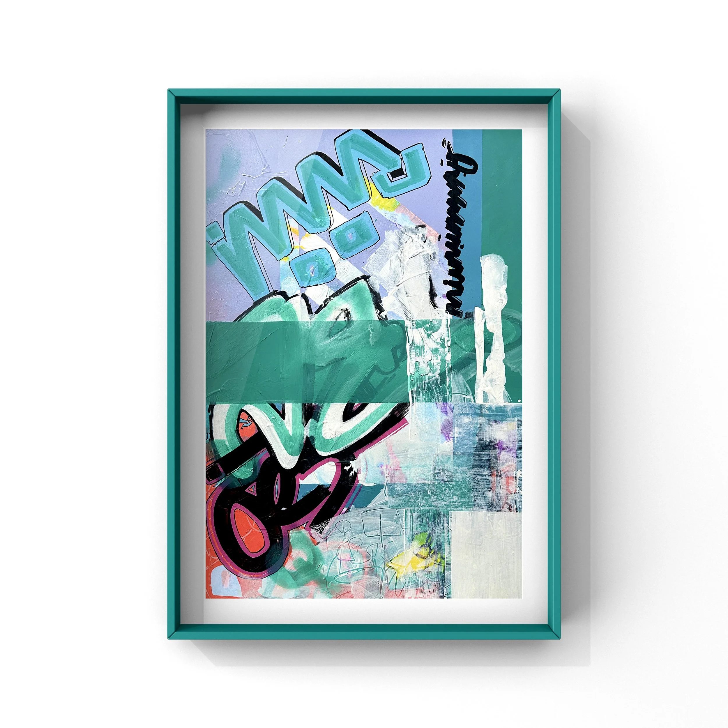
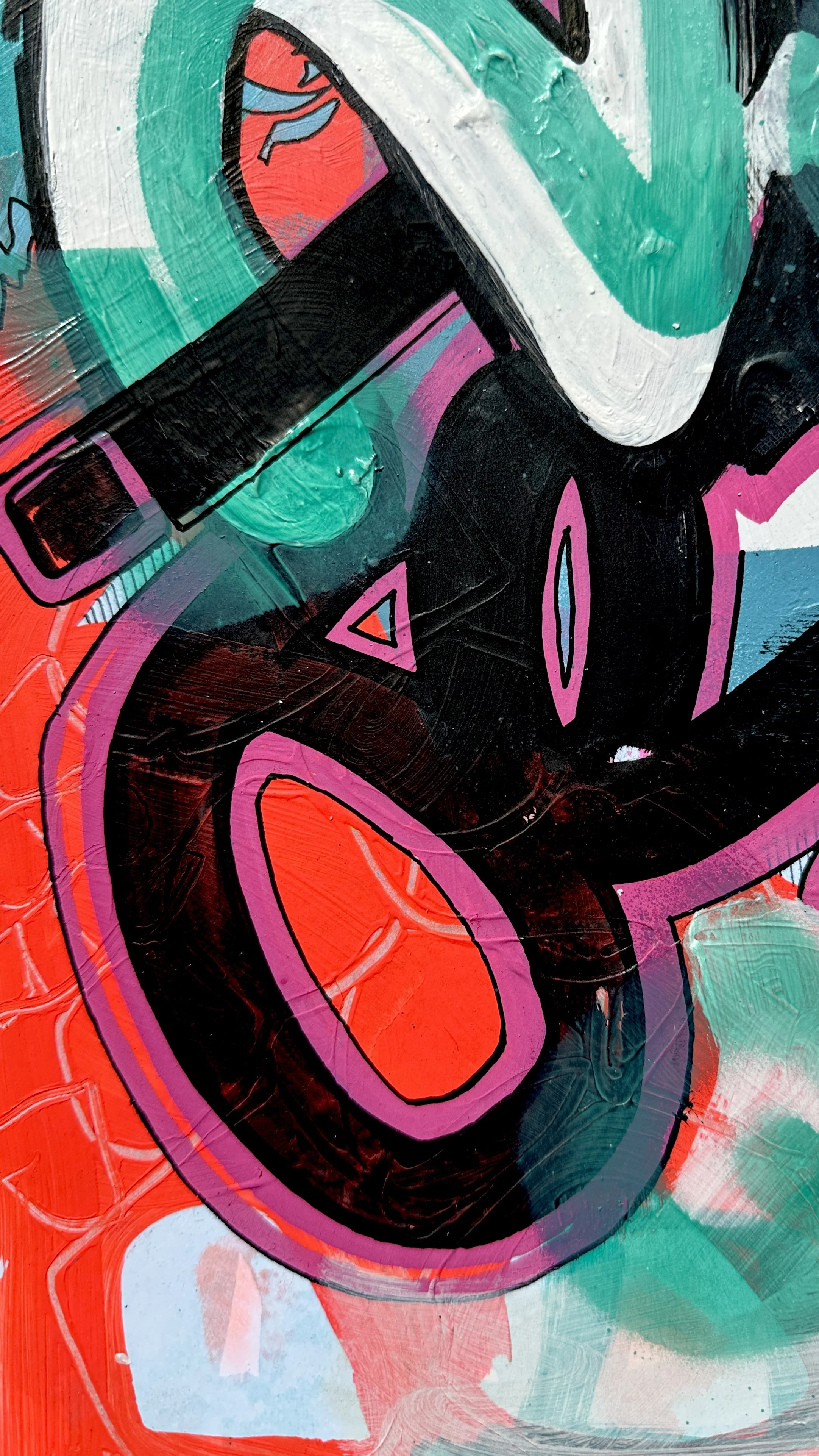
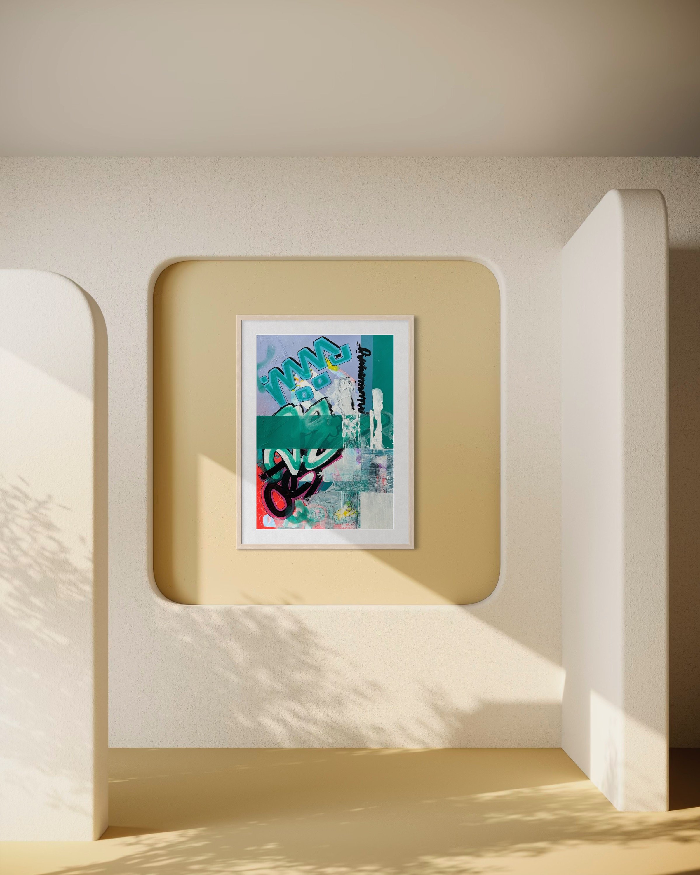
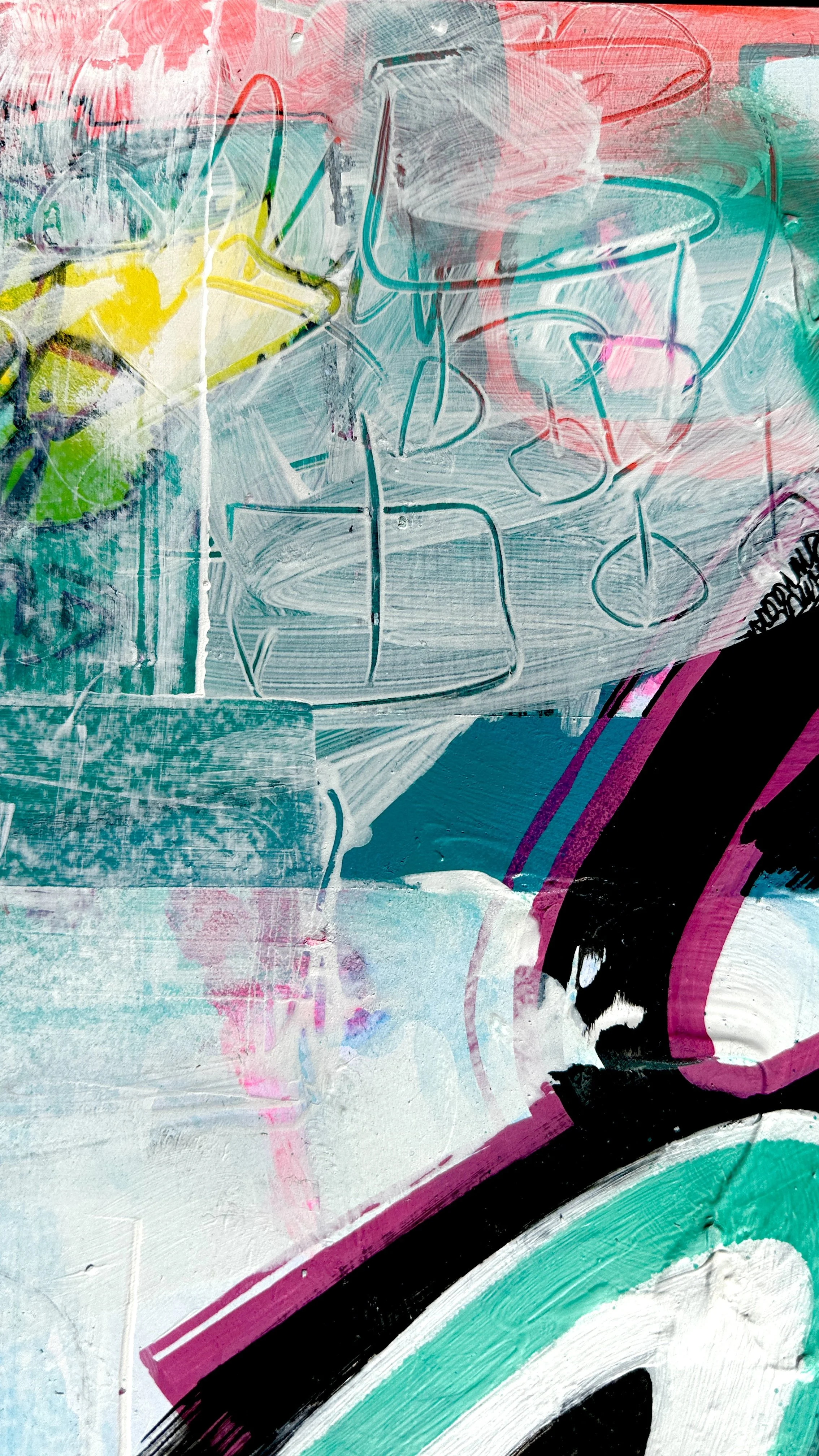
‘untitled 06’
Mixed media on 500gsm card
42 x 69.4cm
£375
Prints available
...we edit, obscure and the reveal again…
“This piece came from a place of tension between structure and spontaneity. I was exploring how color blocks and gestural marks can coexist — the clean geometric elements versus the raw, expressive layers underneath. The teal and lavender tones became a kind of conversation between calm and chaos, with the bold black and coral shapes interrupting the surface like thoughts breaking through noise.
I’m drawn to the language of graffiti and street art — not necessarily for rebellion, but for the immediacy and honesty it brings. There’s something powerful about the layering, the covering and uncovering, that mirrors how memory works: we edit, obscure, and then reveal again.
This painting is about that process — about letting go of control, trusting movement, and finding beauty in imperfection and interruption” - EmmaAnne, Wiltshire
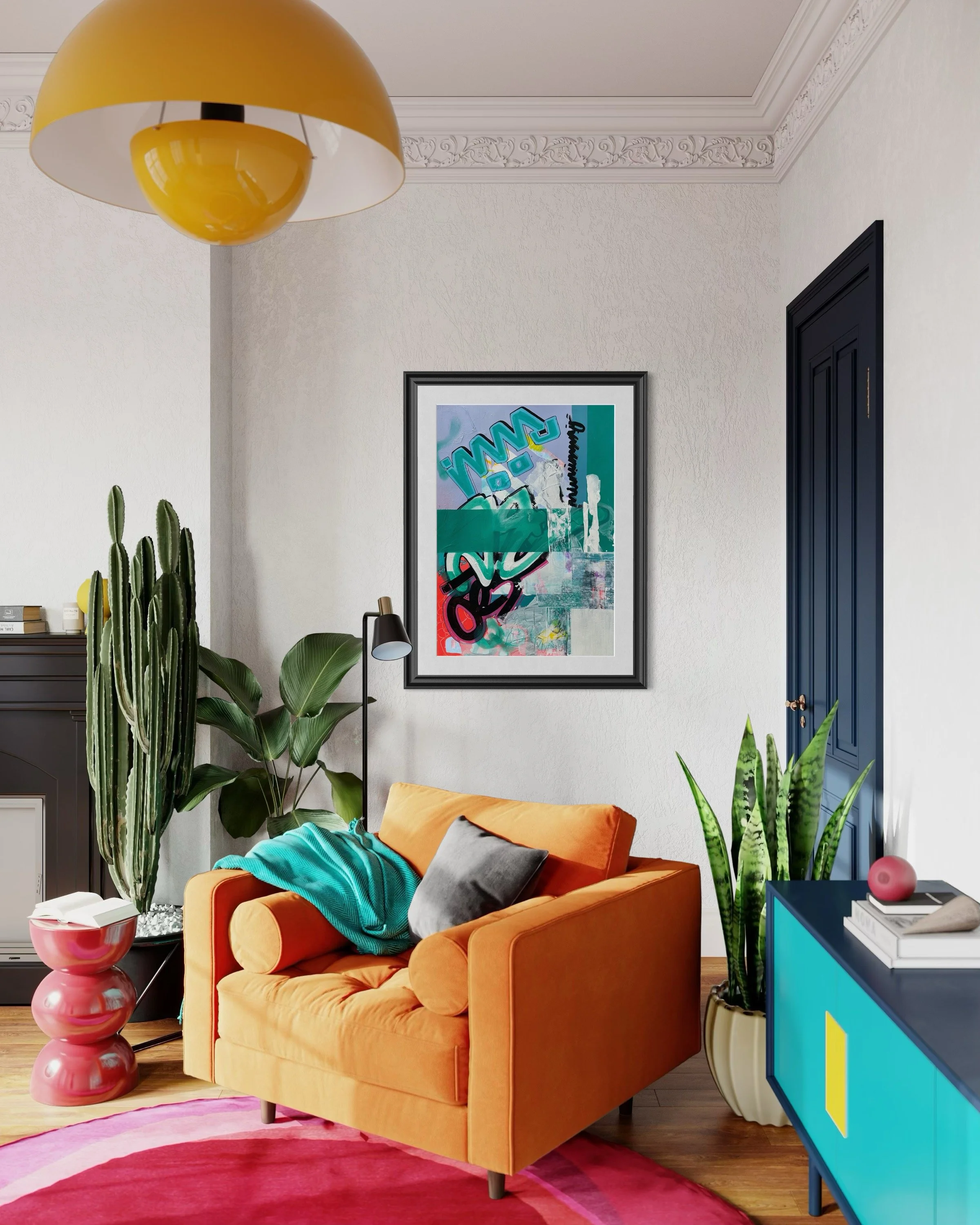
…suddenly the room had rhythm and a sense of purpose…
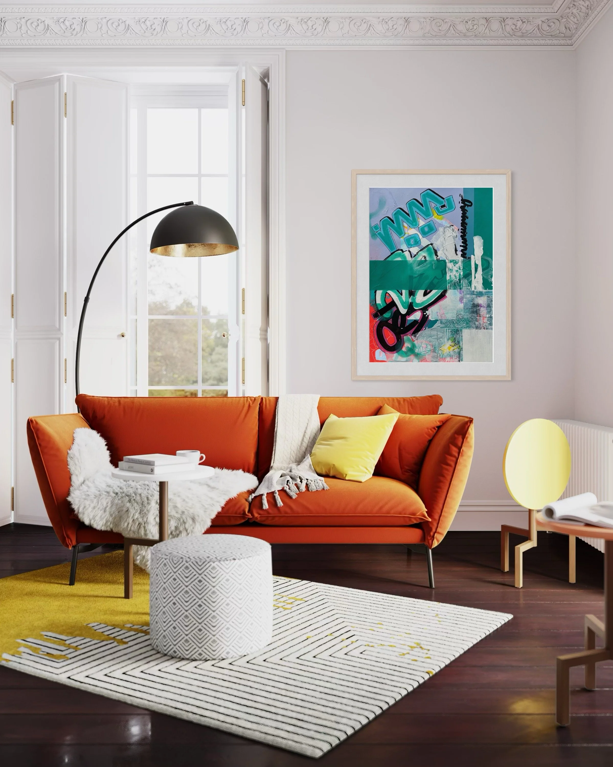
“When my partner hung it in the living room, the space shifted. The light from the window hit the teal band just right, and suddenly the room had rhythm and a sense of purpose— a pulse. Friends would stop mid-conversation to ask about it: What does it mean? What drew you to it? But it wasn’t about meaning to us — it was about the energy it brought to our living room. It brought a sense of creative boldness, a reminder that life doesn’t have to stay inside the lines. Every time we pass it, we feel this spark again — the permission to move freely, think wildly, and let color take the lead once again…” Bev Smith- Wiltshire.
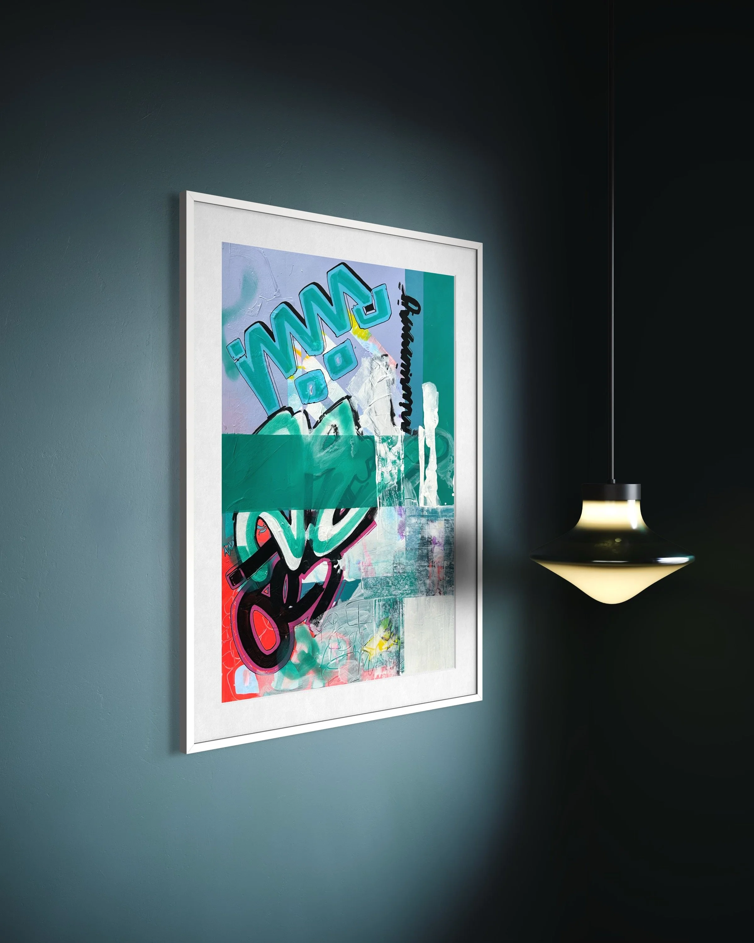
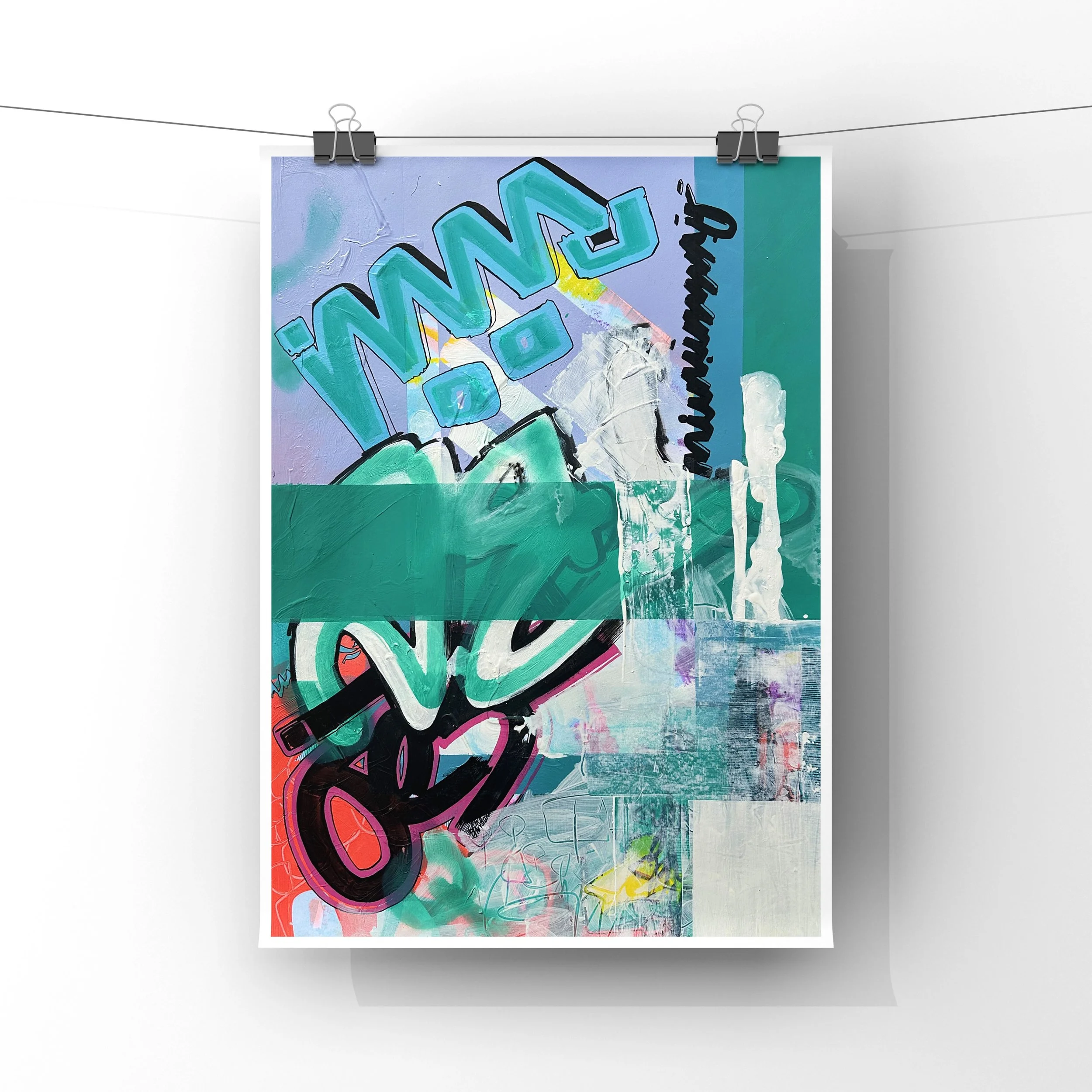
…discussed which size would suit our space…
“We decided to have our print framed in a clean white frame and mount — this print brings color and energy to any room. We opted for the A3 option and discussed which size would suit our space with Emma via email, she was really helpful and put our mind at ease as this was a first for us. Thanks!” - Xander and Jess, London.
…Memory itself were painted over but never fully erased…
‘The composition began with instinctive strokes of turquoise and magenta — two colors that both clash and harmonize — setting the emotional temperature of the piece. Layers of white were then dragged across the surface, softening edges and suggesting the passage of time, as if memory itself were painted over but never fully erased’ - EmmaAnne, Wiltshire.